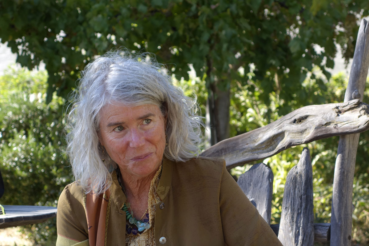
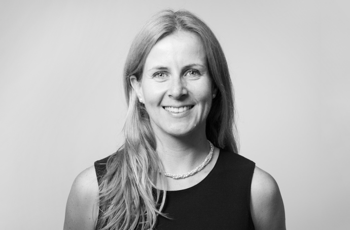
Colored Horse Studios co-founder Theresa Whitehill has a background (Mills College Book Arts Program) in the study of typography, book arts, poetics, and letterpress that sets her work apart from designers who are primarily visual or whose training began with the digital revolution. With dual studios located in northern California’s Ukiah and in Napa Valley, she has been a member of the Graphic Artists Guild since the founding of her business in 1993 and has served as a presenter for their popular webinar, The Pricing Game. With over 30 years’ experience in both graphic design and literary arts, her interrelated focus provides consistency and depth to projects ranging from websites and graphic identities to publications and packaging. Theresa was a finalist judge in the Fine Art and Commercial segments for ADAA 2016. The judging took place at Adobe’s offices in the Design District of San Francisco, California in August of this year.
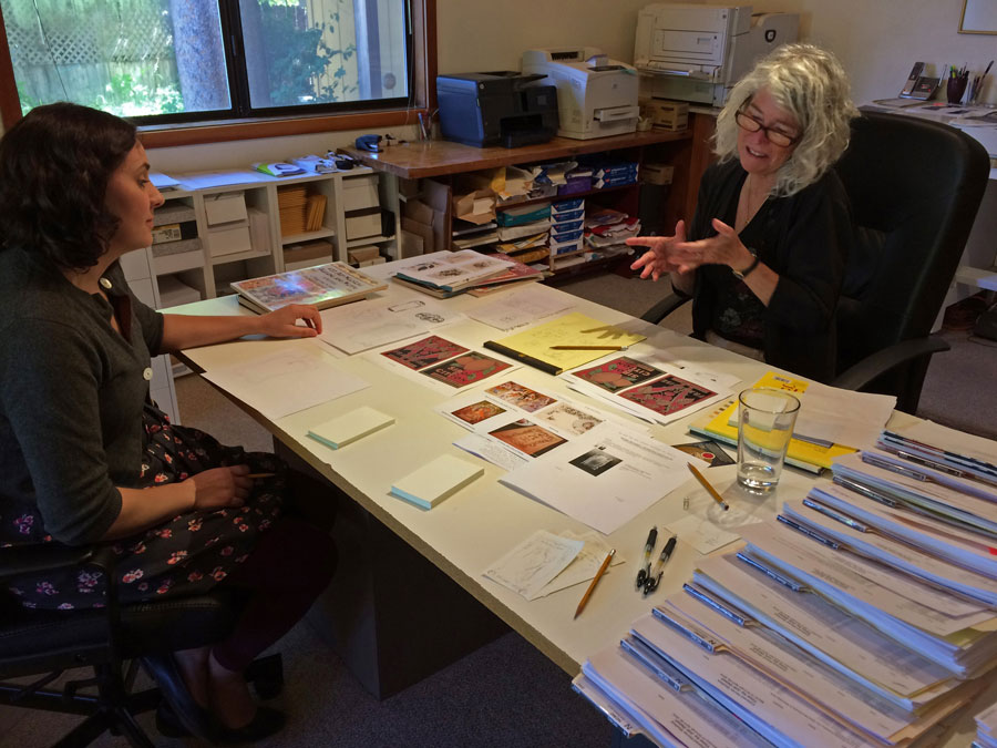
A design session at Colored Horse Studios
What do you do everyday as a designer, and why do you do what you do?
The majority of my work is graphic design, and I am also a writer. I do a lot of loose sketching on notepads or at the drafting table, create initial layouts in design programs, and provide direction to my staff for taking an approved design into final production. I art direct outside illustrators, photographers, and programmers, and also spend long hours doing the detailed and exacting production work—finalizing a coffee table book in InDesign, or editing, cleaning, and adjusting 300 images for a print project.
Theresa Whitehill, Ukiah, California http://www.coloredhorse.com/
As for why I do what I do, I find I have conflicting urges within me for stability and for creative freedom, and when I have come to turning points in my life I have often opted for taking the risk to try something that conventional wisdom says can’t be done. I have a passion for craft, and once I find a creative outlet I want to find out as much about it as I can. I want to know how to do it, what the tools are, how much I can do myself, and who can help me with the rest. I am always driving myself to learn more. This has expanded into teaching others how to follow this path. Having employees has allowed me to take on larger projects than I could have otherwise done. It also satisfies an inner urge to pass on the knowledge.
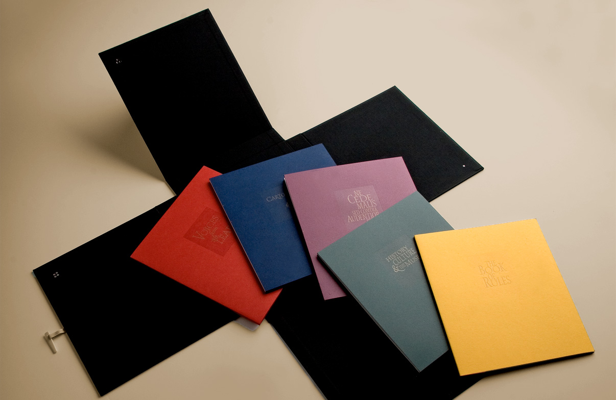
Stags Leap Winery Estate Book by Colored Horse Studios
Tell us a bit about your path to becoming a professional designer and some of the challenges you faced.
I began as a poet and started my training as a photo typesetter and eventually ended up at Mills College in the Book Arts program in the early 1980s, hand-setting lead type and creating unusual bindery structures that allowed me to present poetry in surprising contexts.
North Coast Brewing Rasputin wearables designed by Colored Horse Studios
I ended up in rural Mendocino County with a newborn daughter and a minimum wage job at a letterpress design shop. My employer, Zida Borcich, had a fantastic and utterly engaging design sense. She mentored me in so many ways, spiritual as well as practical. When I left her shop and started Colored Horse Studios in 1993, I was scared of being on my own and also determined. I was scrappy and obsessive, retraining from letterpress to Photoshop 2.5 in a matter of months, doing the laundry or getting out for a walk while the program was cranking through a 45-minute cycle on a photo filter.
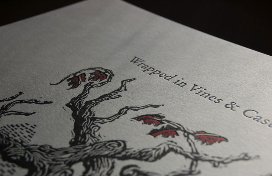
Wrapped in Vines Letterpress by Theresa Whitehill
With the restricted budgets of most of my rural clients, I was forced to solve complex design problems and also keep them affordable. All of this placed me deeper and deeper into the software interface, wrestling with it to get spot colors correct without proper or affordable proofing procedures. One day, I got a phone call asking if I was interested in being Poet-in-Residence at a winery in Napa. This has lead to projects naming vineyards, designing winery brochures and websites, and helping wineries create fresh ways of presenting their stories in written and visual form.
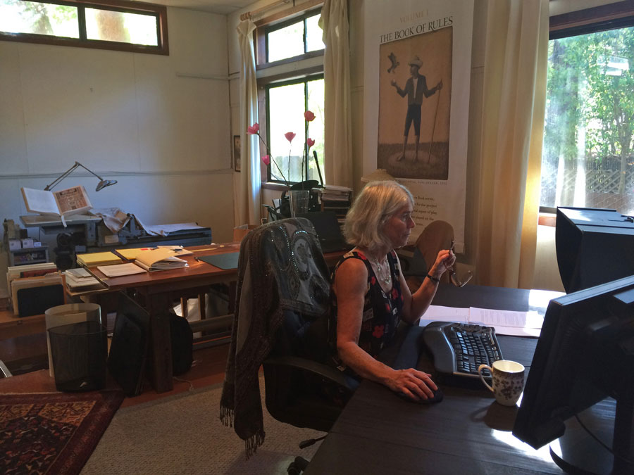
Theresa working in her writing study, Ukiah, California
How has becoming an ADAA judge fit into this overall path?
When I first got the invitation to judge, I felt extremely honored and also a little intimidated. How could I, who never completed a formal design program, hope to contribute among judges who had degrees under their belts and quicker, less quirky paths to professional experience? But then it struck me just how appropriate it was. I know a lot and I have a body of work that shows it. I have often felt isolated in my work, without many people with whom I could truly talk shop. When I arrived at the Adobe campus and met some of my associate judges, I realized that I didn’t have to live in this isolation any longer; I have this whole new community.
Can you describe what the judging process involved (communication with other judges/ engagement with the student work/consideration of cultural context/travel and networking among other judges, etc.)?
We had to get up to speed quickly and learn the rules and process of the judging, and I was grateful that we had the participation of ico-D, ensuring that the judging was run in a way consistent with best practices for competitions. This allowed the judges, who might otherwise have gone down all kinds of rabbit holes wondering about the process, to relax and enjoy the experience.
I was struck by how patiently we worked as a group, sometimes backtracking when we got off course and neglected something that ended up being quieter, not as dramatic, but ultimately more unified or more original. I appreciated the sense of responsibility that each judge showed in making decisions that would help some very creative and talented younger designers on their path.
One project that was up for consideration was disturbing to me. I felt it made light of a serious social issue without showing any deeper thinking about the causes or consequences, and was merely playing on it for sensationalism. I had to speak up and express my confusion. Another judge pointed out that we should be focused on excellence. To him, this piece, while initially rather exciting, ultimately was not well executed. It was a great moment because at that point the judges did their job. They began to look at the entry from a new perspective and found several things rather wanting about it, and ultimately another entry was selected as winner of the category.
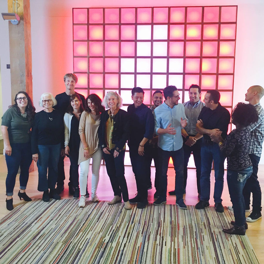
The ADAA 2016 Final Judging Panel at Adobe’s offices in San Francisco. Lisa Temple http://www.adobeawards.com/us/judges
What about this process surprised you, or did you find to be enriching? What did you find to be challenging about it?
A lot of the student work was more advanced than I had anticipated, and in some cases I felt the students might have more to teach me than the other way around. I could see the benefit of formal training in design and technique, and in the presentation of the submissions.
We found numerous entries that were in need of a little curating. It was frustrating when a student would submit a group of images, among which were a few outstanding images or ideas and then far too many mediocre pieces. We wanted to see the submission contain only the absolute best.
Given the range of design work you saw, across both disciplines and countries, do you have any new thoughts or insights on the state of design among youth today?
As someone who has learned most of my skills on the job, this helped me see the value of university-level design programs. In addition to focusing on students who are already in design programs and helping them transition to the beginning of their professional careers, I can also see the need for some kind of recruiting and scholarship process that would enable high school or community college students to get into a design school.
Could you talk us through a few of the more interesting pieces you saw whilst judging? For example, works that stood out for you personally or that you simply found intriguing or compelling?
Biotop, Jola Bańkowka, Warsaw, Poland
https://www.behance.net/gallery/36278115/Biotop
This piece was so beautifully rendered and paced, with the context not evident until the last touching moments, that I broke down in tears.
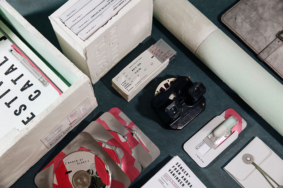
My Loyal Slaves, Yun Chih Chung, San Francisco
https://www.behance.net/gallery/36899139/My-Loyal-Slaves-Film-Festival
This promotion of a film festival was a thorough pleasure, beginning from an interesting concept and subject matter that was compelling and gritty. It was clearly and cleverly thought out and then meticulously produced, from the choice of materials to the typography and the art direction of the photography.
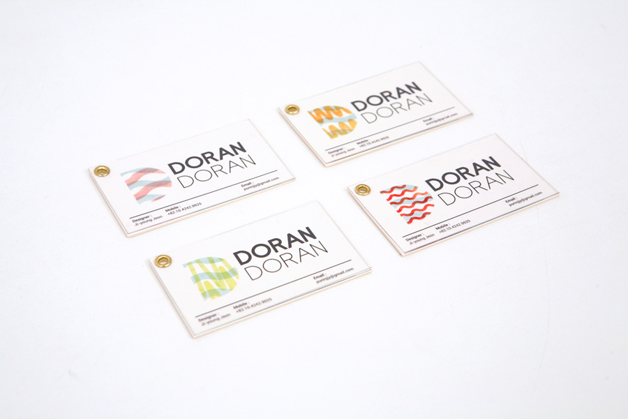
Doran Doran, Ji-young Jeon, Seoul, Korea
https://www.behance.net/gallery/32482361/A-liquor-brand-DORAN-DORAN
The concept for this project struck a chord with me—creating a product that would help fathers and daughters have more satisfying conversations. The fact that it is an alcoholic beverage added to the creative approach because it was done with such a light touch, and was all the more unexpected, providing layers of enjoyment and irony.
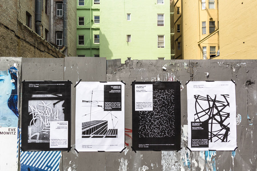
Tenderloin Fanzine, Erik Berger Vaage, San Francisco
https://www.behance.net/gallery/35970547/Tenderloin-Fanzine
A beautiful example of a project that purposely chose to focus on a client or design problem that involved solutions for lower budgets. The choice of newsprint and lower grade media for a museum in San Francisco’s Tenderloin district was perfect, along with the loose and edgy graphic aesthetic. The succinctness of the data spread, highlighting “Liquor Stores 66; Grocery Stores 0” was masterful.
About Adobe Design Achievement Awards
__
Since 2013 ico-D has partnered with Adobe, creating the Adobe Design Achievement Awards as well as a mentorship programme that offer students career advice, industry exposure, networking, creative residencies and the possible pairing/sharing between aspiring design students and established designers. The goal is to hotwire the transition from school to professional practice, including programmes like the ADAA 2016 Creative Residencies and Career Bootcamps. By revamping the programmes to ‘launch student careers,’ the ADAA Awards and its extended programmes are making the leap from design education into design as a career—smooth, successful and profound

